The Adapting
Brand & Graphic Design
The Twitch Streamer The Adapting asked about developing a brand for his channel to increase his number of followers. He didn't have much in the way of a brand so far; I only had to work with his streamer name and the kingdom theme the channel and discord server had. By the end of the discussion, we decided what he needed was;

• Branding Package:
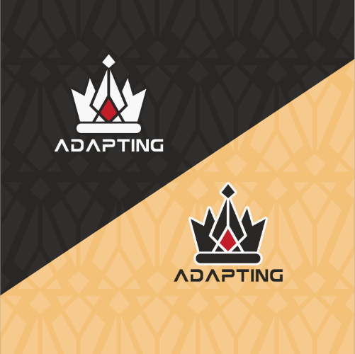
○ Logo, branding, watermark, signature,
• Social media and shop Banner:
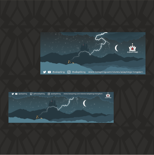
• Banners for his Twitch channel's about page,
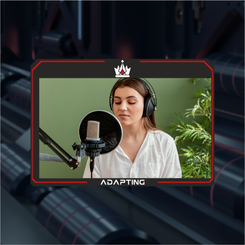
• Camera overlay,
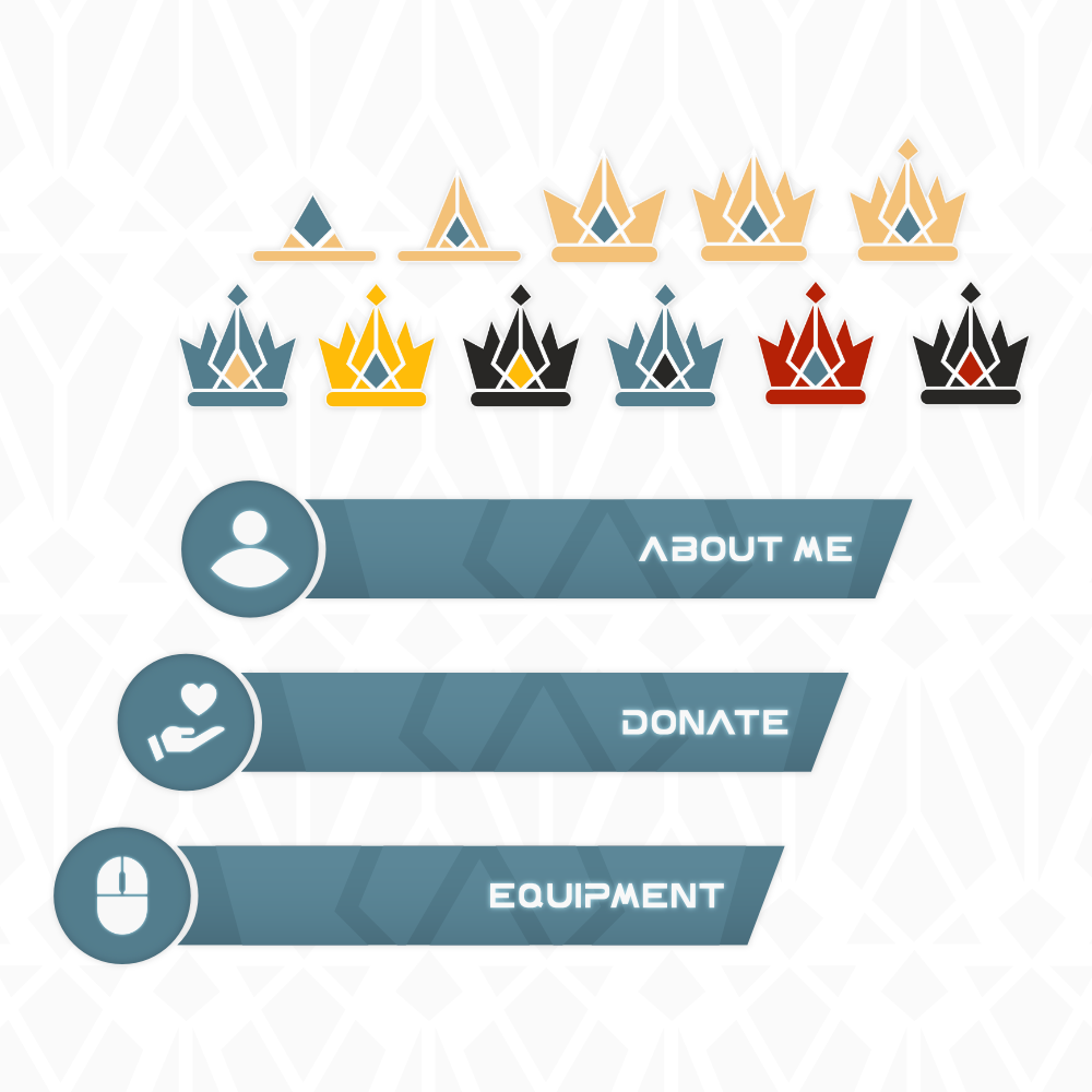
• Sub badges.

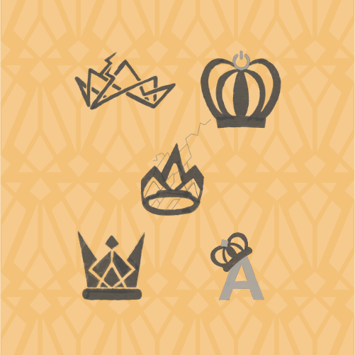
After researching the channel and the industry to better understand the client's needs, I started brainstorming ideas for logo concepts for the brand. From the meeting, we agreed that a crown would be the central idea of the logo. The rest of the branding focuses on the crown, red lighting (based on the channel's most played game SMITE, mainly he plays as Thor and Fenrir), and again Kingdom. The home banner needed to be exciting and suitable for a background, so the solution was an illustration of a mountain range with a castle in the background and lighting. I pulled inspiration for the logo concepts from the lighting; however, the idea that the client liked best-pulled inspiration from the pattern on Thor's shoulder plates.

This project had two main challenges: figuring out an intriguing crown design and not a generic-looking crown; the other challenge was figuring out the right font for the logo; for the body text, we agreed on Google Fonts Play, but that didn't fit the logo 100%. For the logo font, I created a font from scratch, which I also used on the twitch banners; the font itself that The Adapting could also use in designs in future. Another challenge was selecting a colour for the twitch banners that worked well in light and dark modes. The secondary colour was red, which was too in your face in the dark mode, so we went for shades of the branding blue.

The result was a bold brand with a set of striking illustration banners; an interesting overlay with red lighting effects on the border. The overlay doesn't detract from the stream but makes it feel like a more professional production. The sud-badges for the followers slowly build up into the logo, the months building up the shape and the years rotating colours till it lands on the right combo. The Adapting was delighted with how the branding turned out.
